The story
As a close-knit team with optimal collaboration between engineering and design, we were at the pinnacle of our capabilities from having successfully introduced a new product into the market, and steadily evolving it to maturity. This gave us confidence to explore new technologies for visualization.
My role: Director of Design, Principal Designer
I assisted engineering with selecting the visualization solution and hired a freelance 3D modeler.
I collaborated with the Lead Developer in adapting our UI patterns to the functionality that was particular to this feature.
The objective
The needs of DevOps teams are predicated on sharing awareness of deployment and release activities. One of the ways to achieve this is with a common view of applications deployed to cloud services and static environments.
The approach
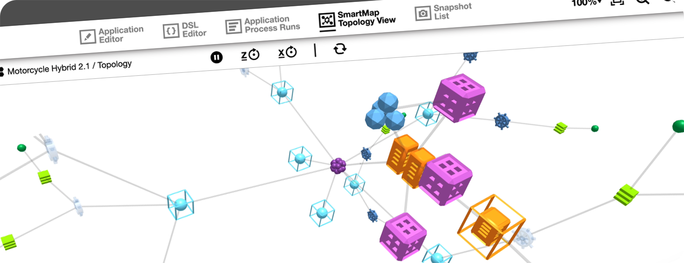
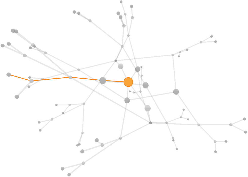
The Star Topology best conveys that the Application is the reference point in DevOps, displaying it at the center of the network.
Users can highlight each connection the Application has to an Environment it’s deployed to, making it easy to trace issues and see which services are active or inactive.
The default behavior to this visualization is the rotation of the network, displaying the complexity and the reach of its nodes. The controls are simply to “Pause” or “Play” this movement, and to freeze a rotational axis.

The challenge to the design resided in devising the 3D iconography. Although it derived from the existing 2D icons, in a third dimension with movement, these icons need to be recognizable from all angles.
We went through an extraordinary number of iterations to find the right color palette that was contrasted for distinguishing each object, while also creating an esthetic pattern.
Adding value
While exploring the possibilities of this framework we discovered utility in being able to hide certain objects, thus isolating a particular connection in the network.
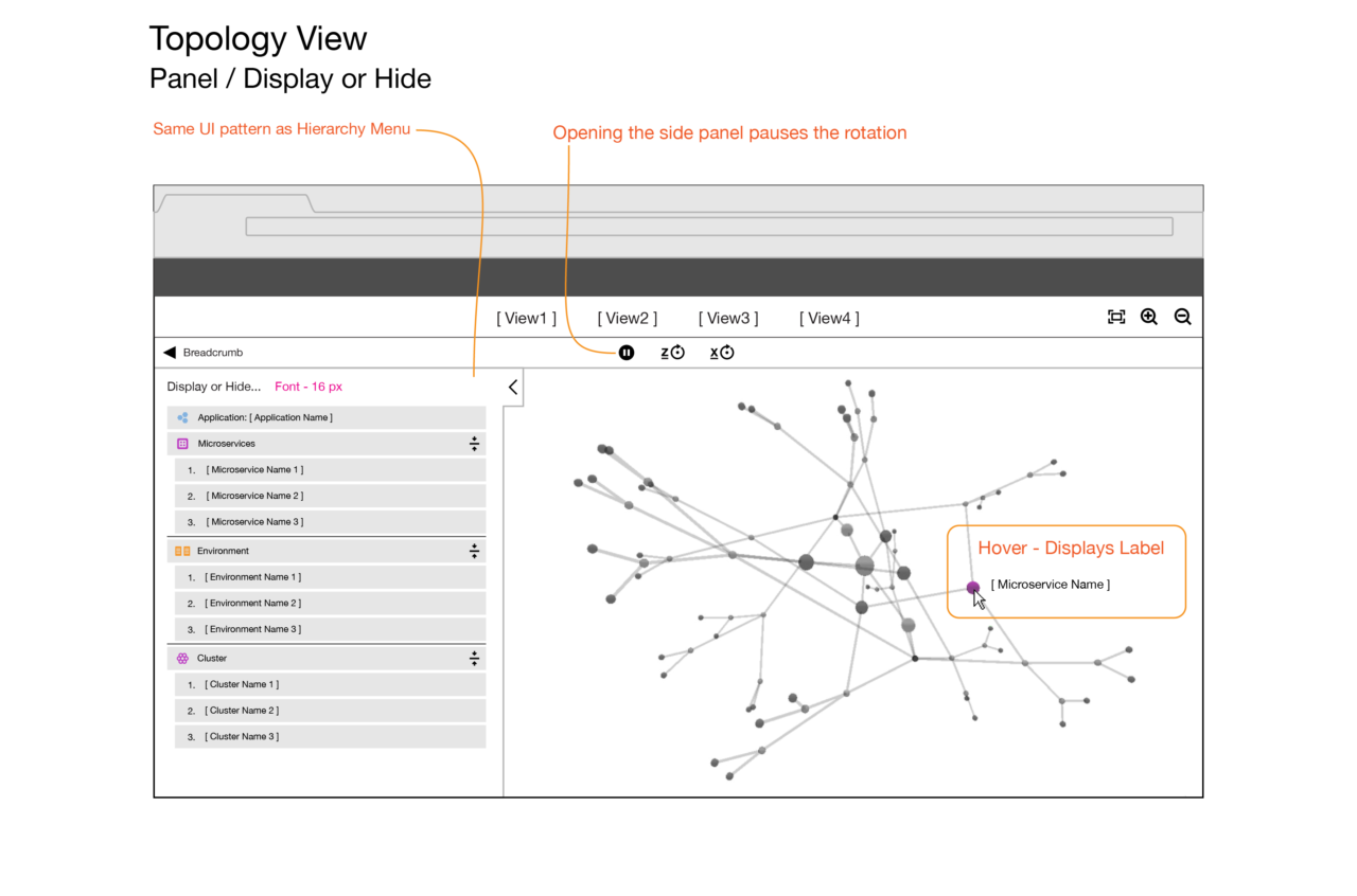
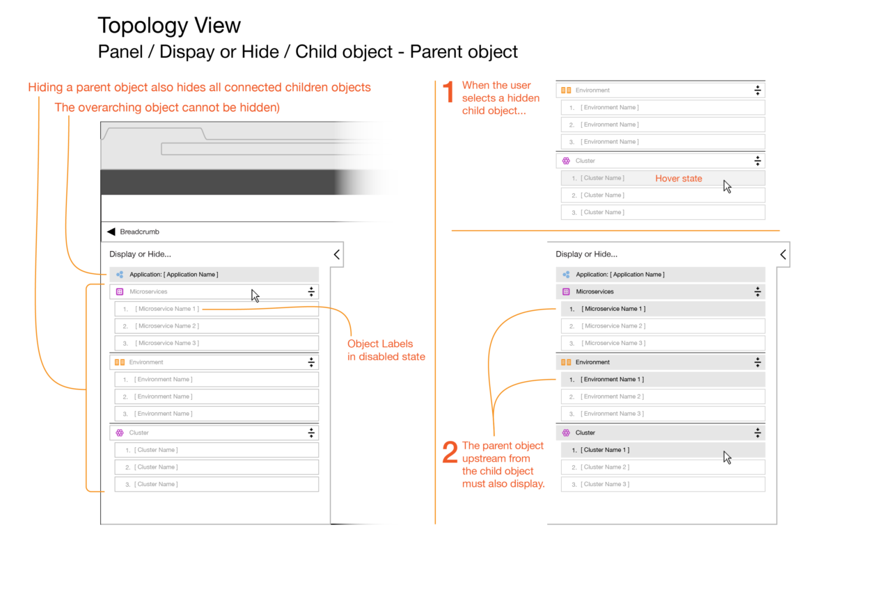
To convey this functionality to the user we presented these interactions within a well adopted UI pattern that listed the hierarchy of connected objects.
Outcome
This feature contributed to moving our position on the analysts’ quadrant upward in the strength of our offering, and furthest ahead of our competitors in strategy as well as vision.
Its usage as intended remains to be studied over the long term, as its adoption is contingent upon organizational factors that customers keep opaque.
User Research ➜
Solutions to getting input
Consumerize Enterprise UX ➜
DevOps Web Application
Core Function UI redesign ➜
Release Automation
Innovation in DevOps UX ➜
Runtime Visualization
Data Visualization ➜
3D Network Topology
Enterprise Mobile UX ➜
Commercial Real Estate Sales
Short Stories + Interactivity ➜
Branded Episodic Content