Overview
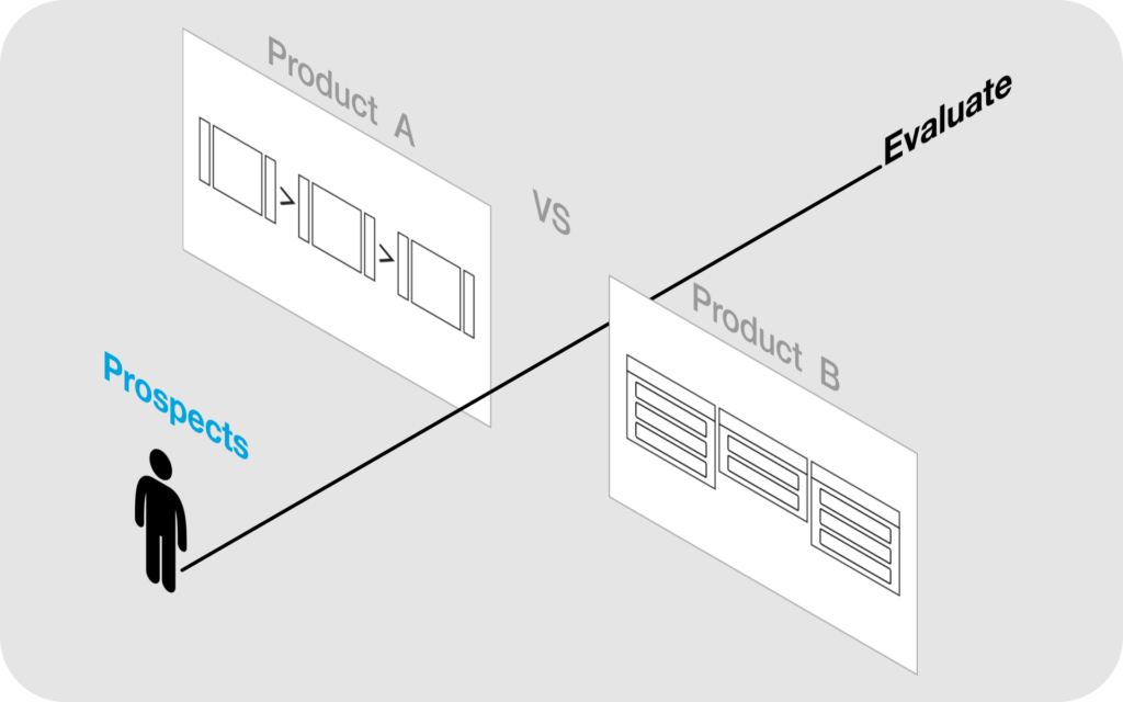
When choosing between the top two DevOps products, prospects were comparing our all-in-one solution to our competitor’s multi-app suite. We offered broader capabilities, better adaptability, and greater scalability, but still would-be buyers hesitated. Why?
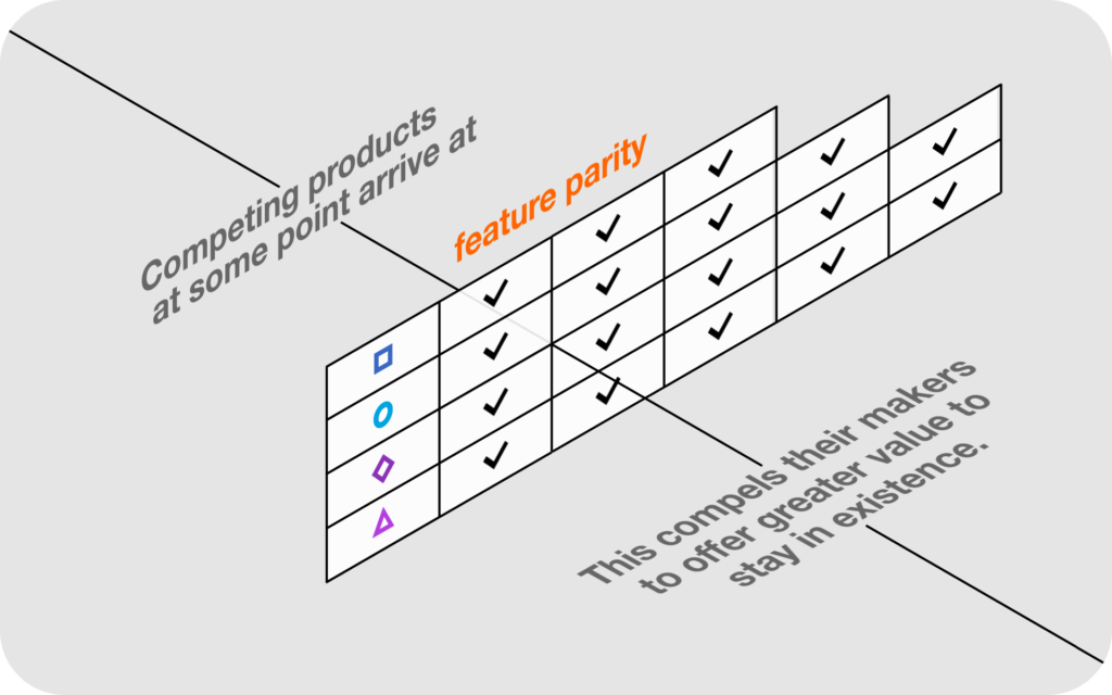

Our flagship product was entering the beginning of its maturity phase as a comprehensive toolset for DevOps-ready organizations with emerging needs from their Release Managers.
My role: Director of Design, Principal Designer, Team Manager
Responsibilities: rationalize new features into design projects and assign them
Deliverables: A/B solutions, validated concepts and final UI
Team: Empower junior UX designers with ownership, and coach them
The challenge
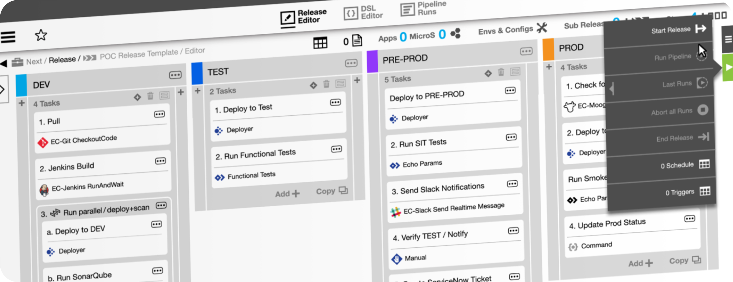
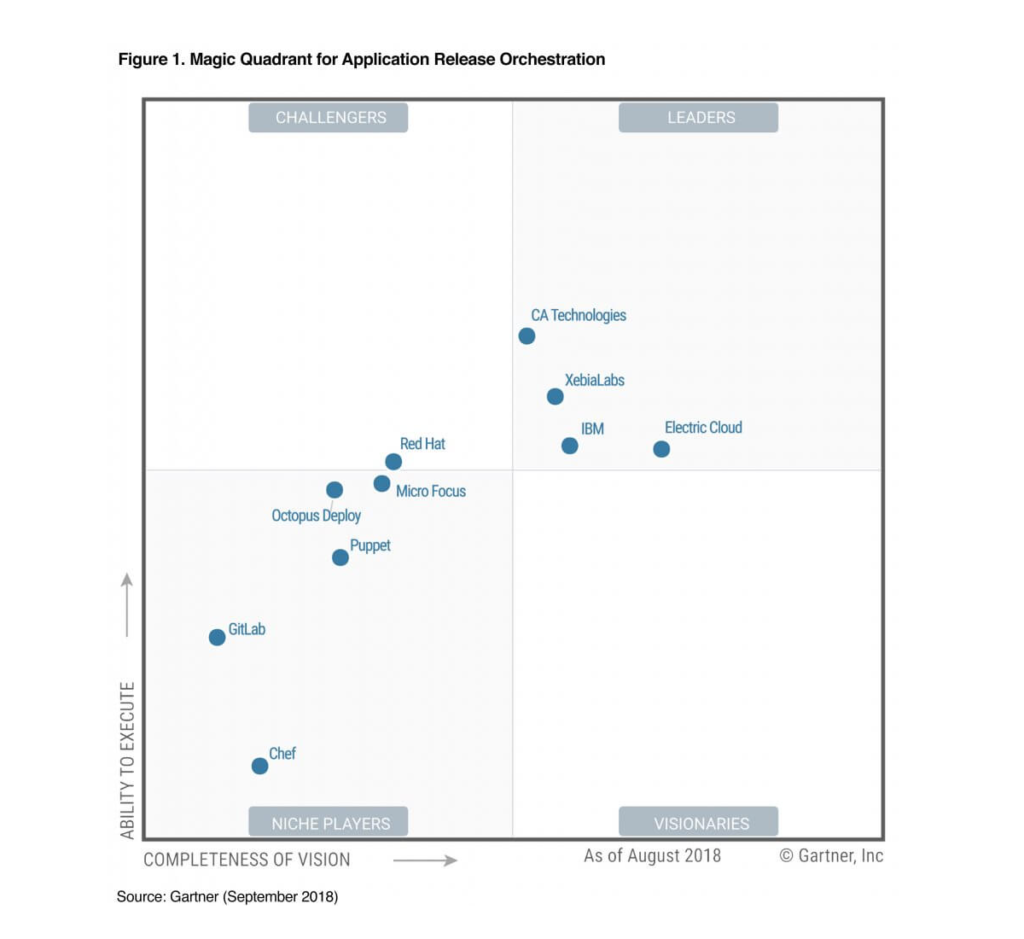
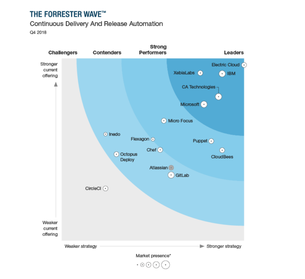
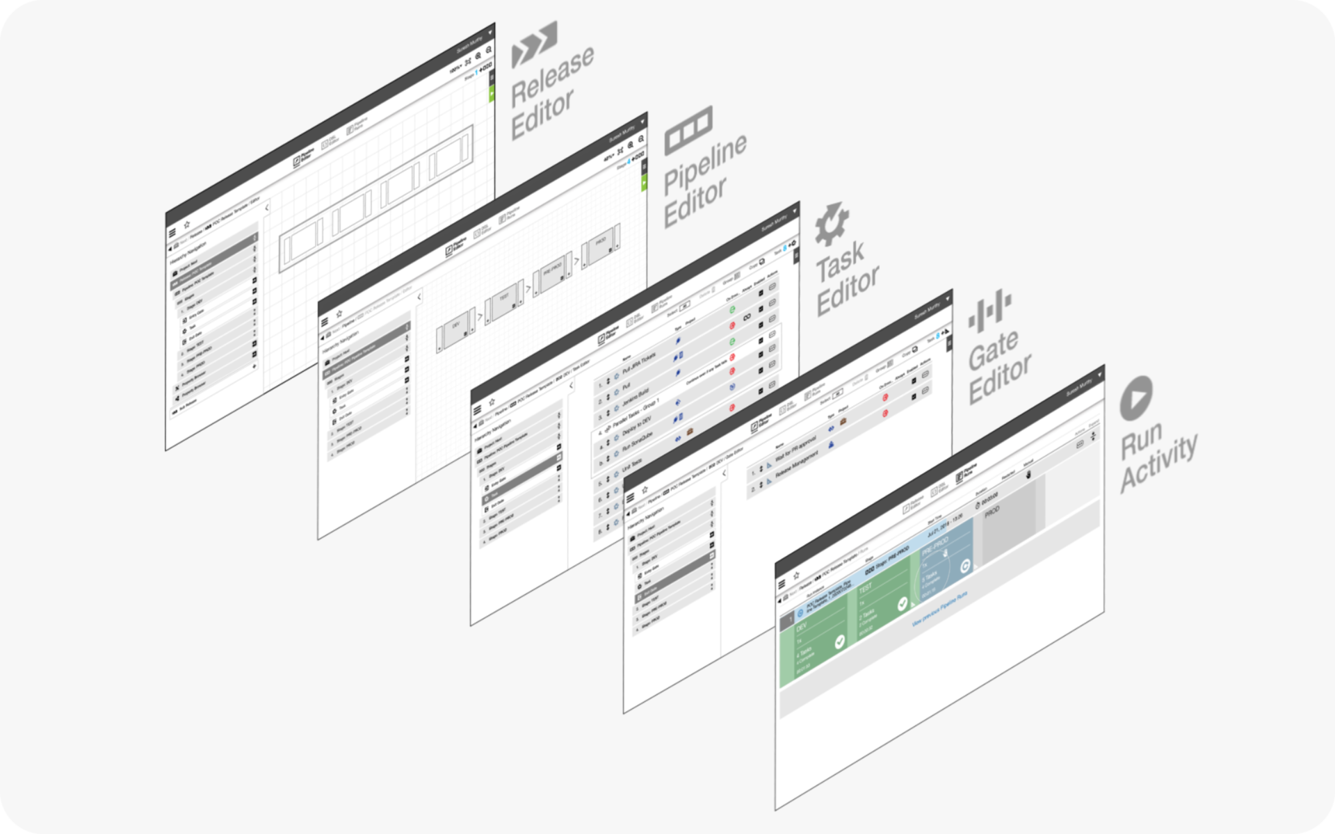
Despite holding a lead on analysts’ reports, sales POC post mortems revealed that our most accessed UI looked unfamiliar compared to the trending Kanban framework.
On a 60-day deadline, we finished the redesign of the Release Editor at the end of Q2, in time to include in our presentation to Gartner and later to Forrester for their 2018 reports. As sales confidence grew in Q3, new deals closed in Q4.
The approach
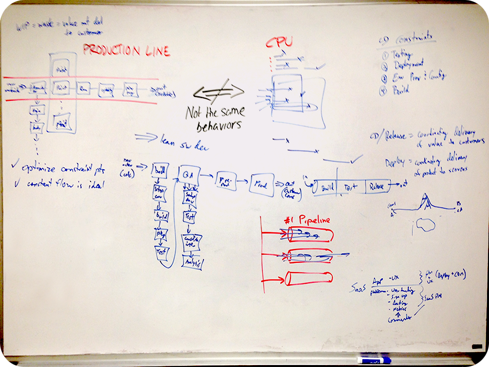
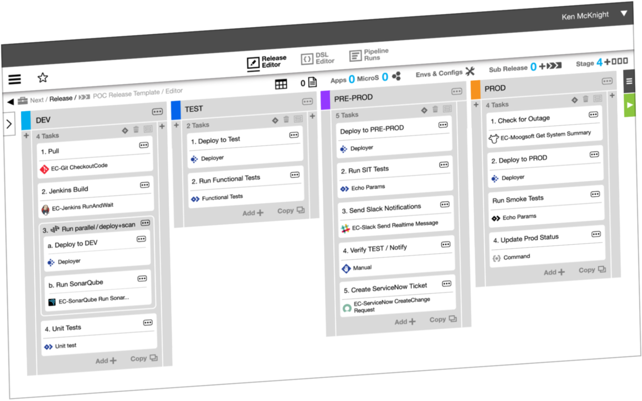
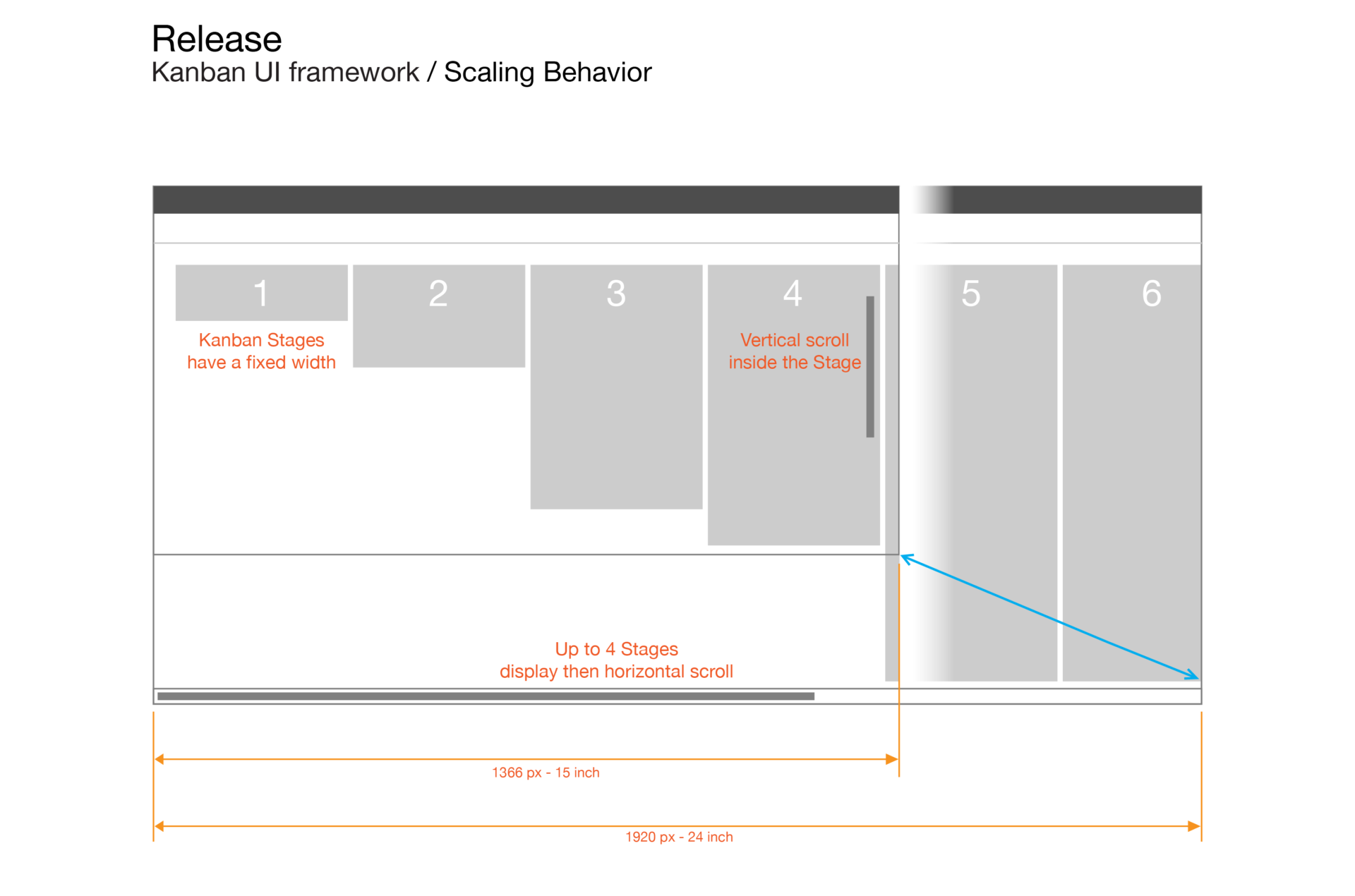
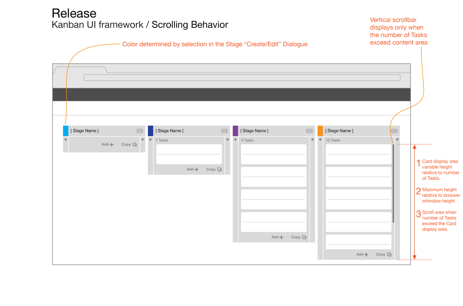
Since the Kanban was already a paradigm adopted by the DevOps community, we could focus on where our version could stand out with the extensive functionality we had already built.
Beyond building a sequence of phased tasks, we saw the opportunity to use the UI framework to also display runtime progress.
- We surveyed which customers would be impacted by the module’s redesign,
- determining the cost for maintaining the legacy UI vs a transition plan, and re-training for large teams.
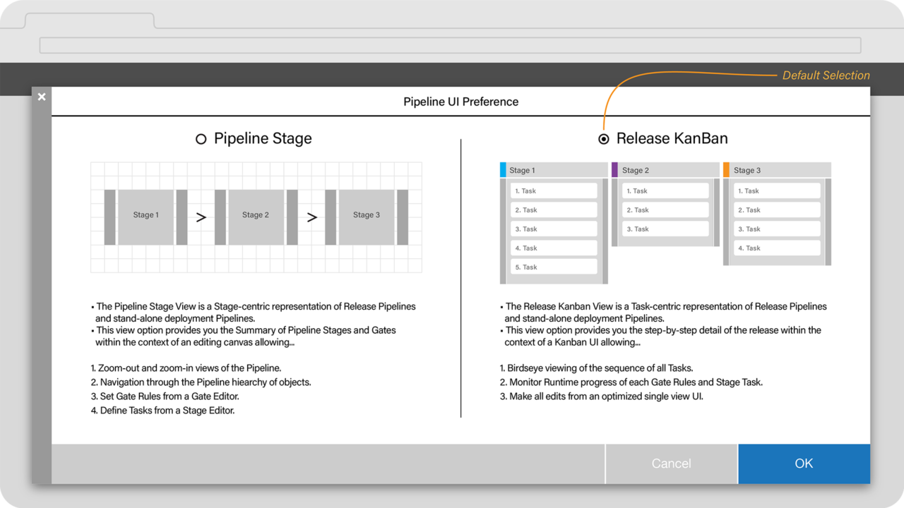
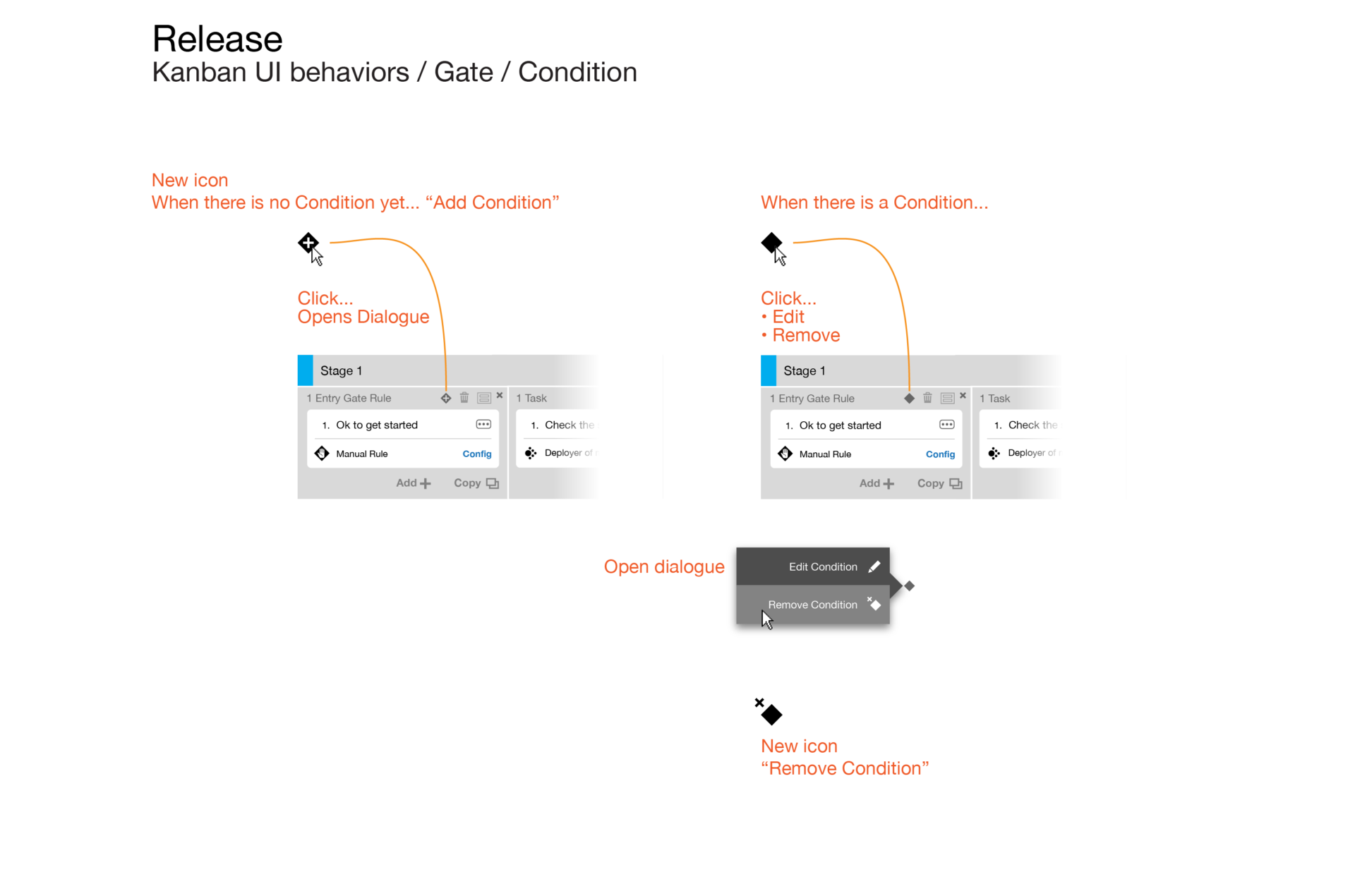
- In the immediate, we designed a toggle in the Settings to switch between the versions.
- We took inventory of the functionality for automating release tasks,
- determining which task flows could be flattened into a single UI,
- and translate them into drag-n-drop patterns to replace sequential setup steps.
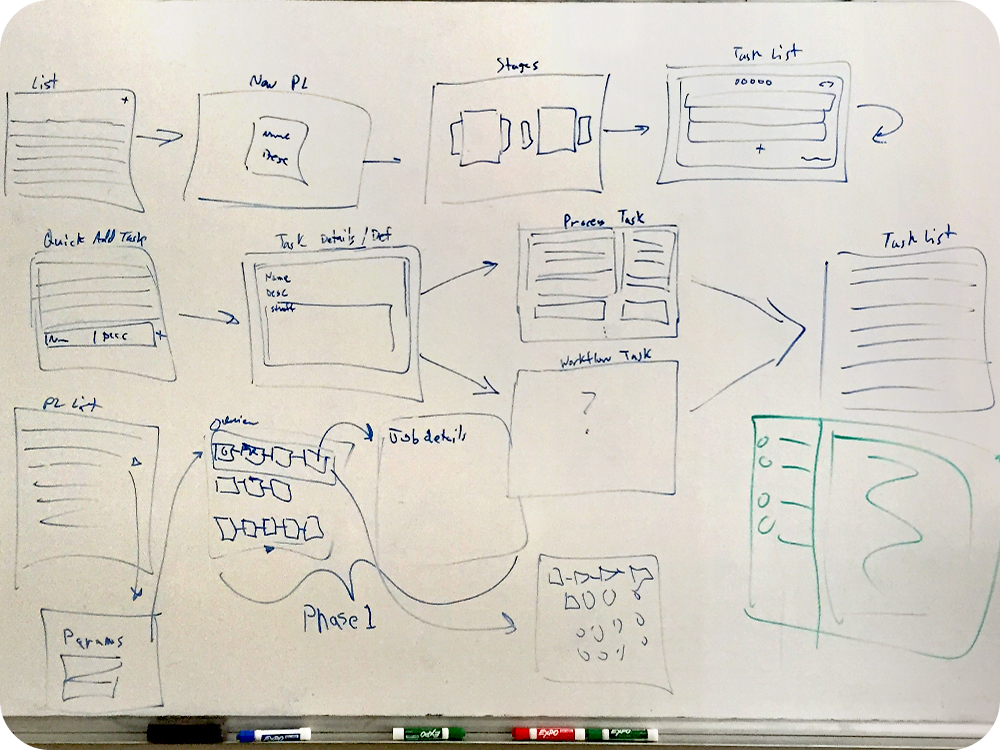
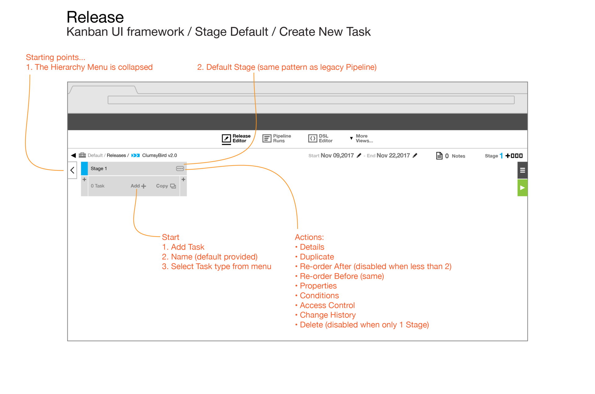
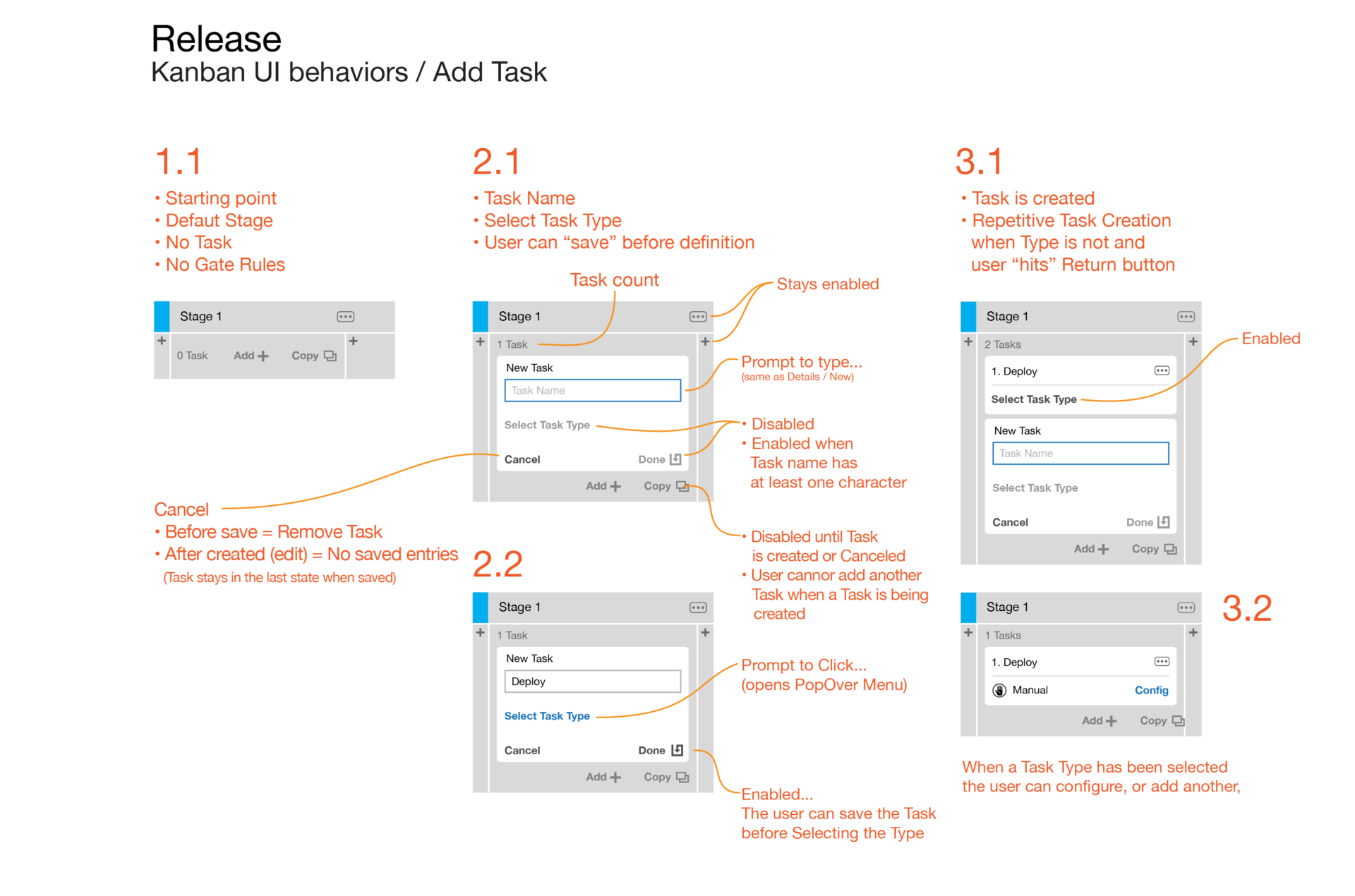
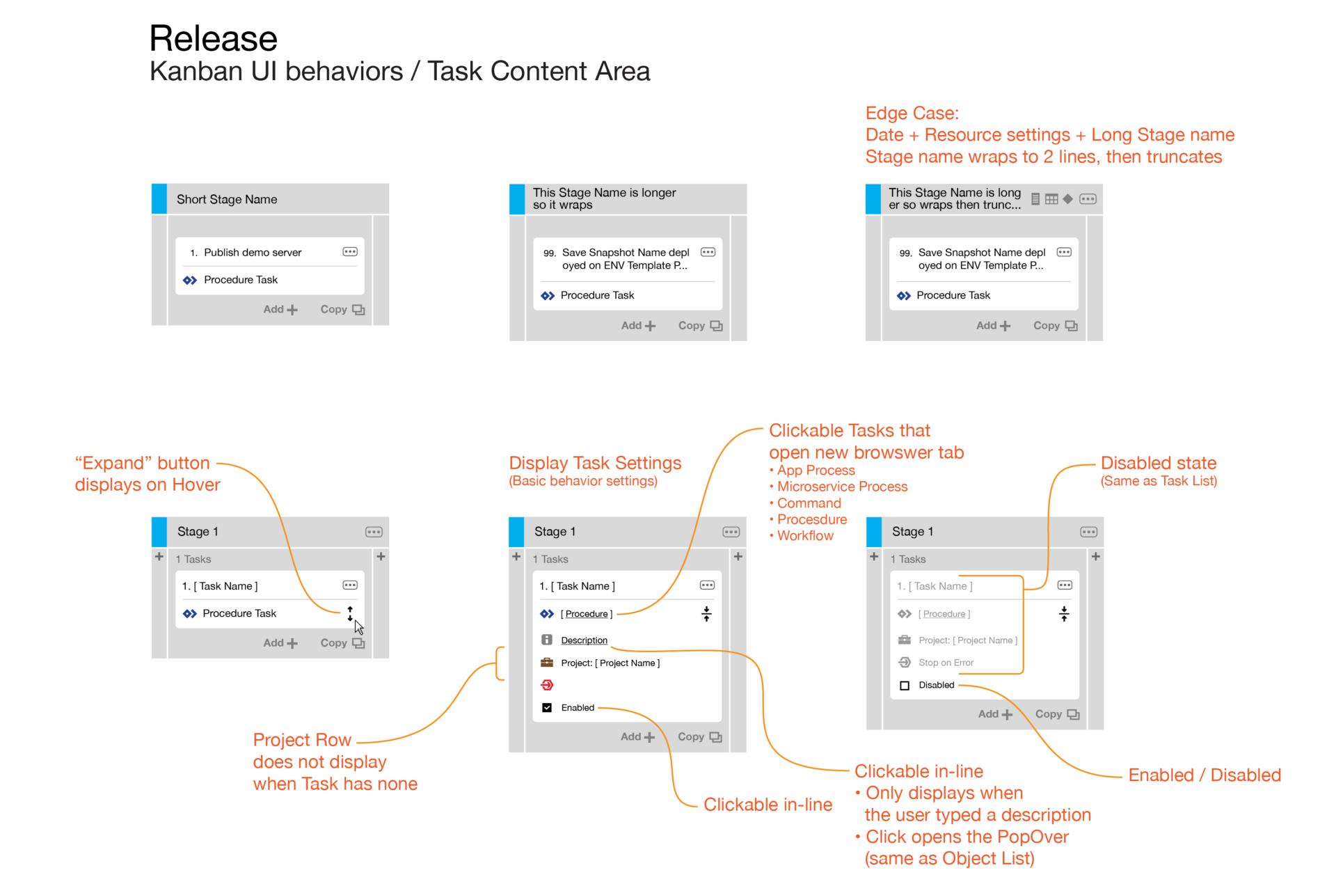
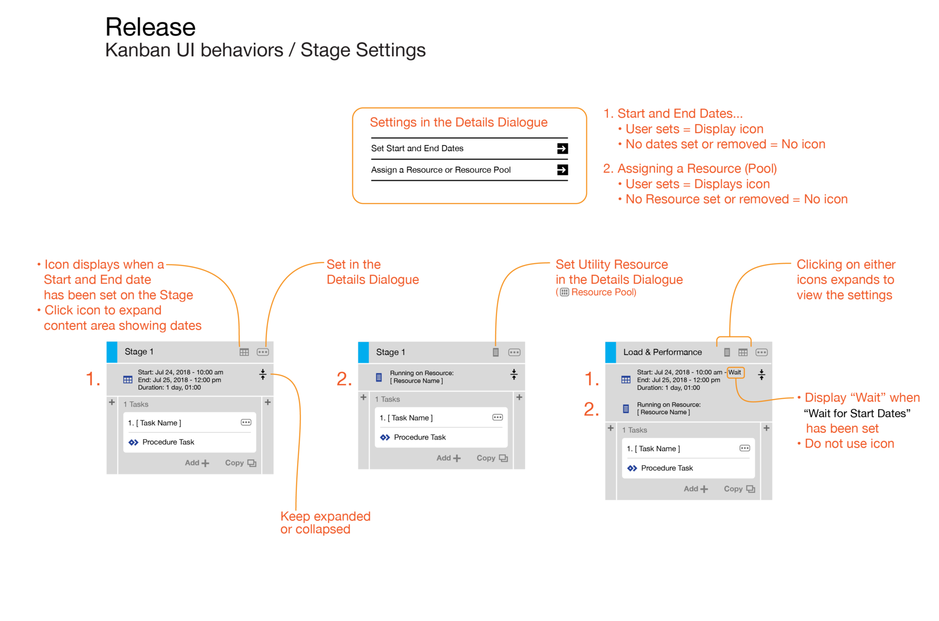
We were able to execute the redesign on a short timeline because we already had underlying interaction patterns for creating parent and children objects that were tested and adopted.
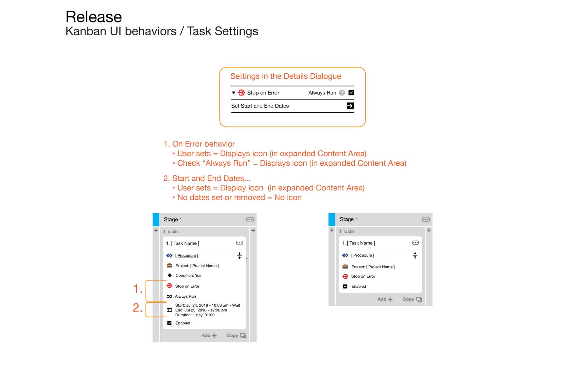
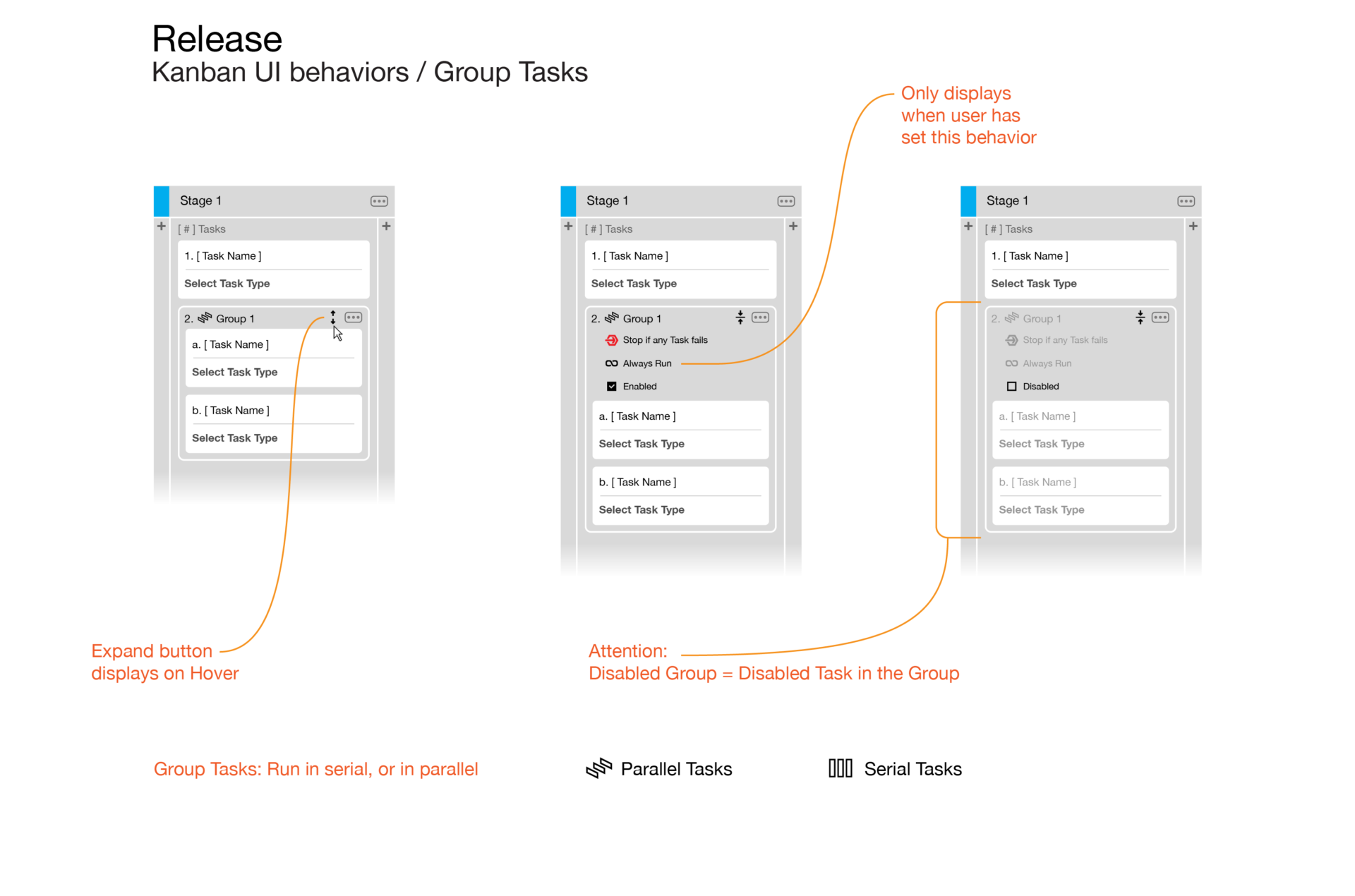
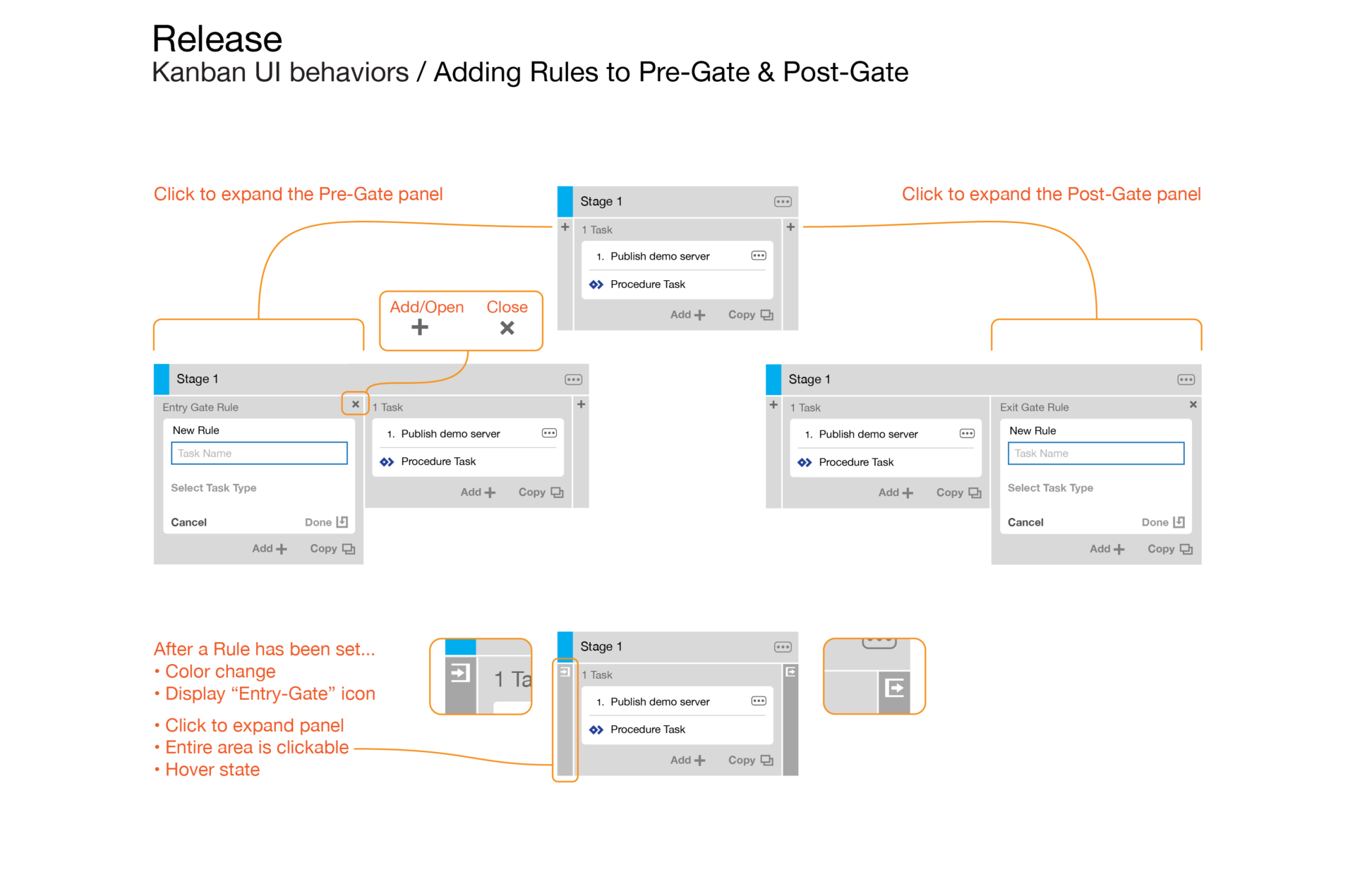
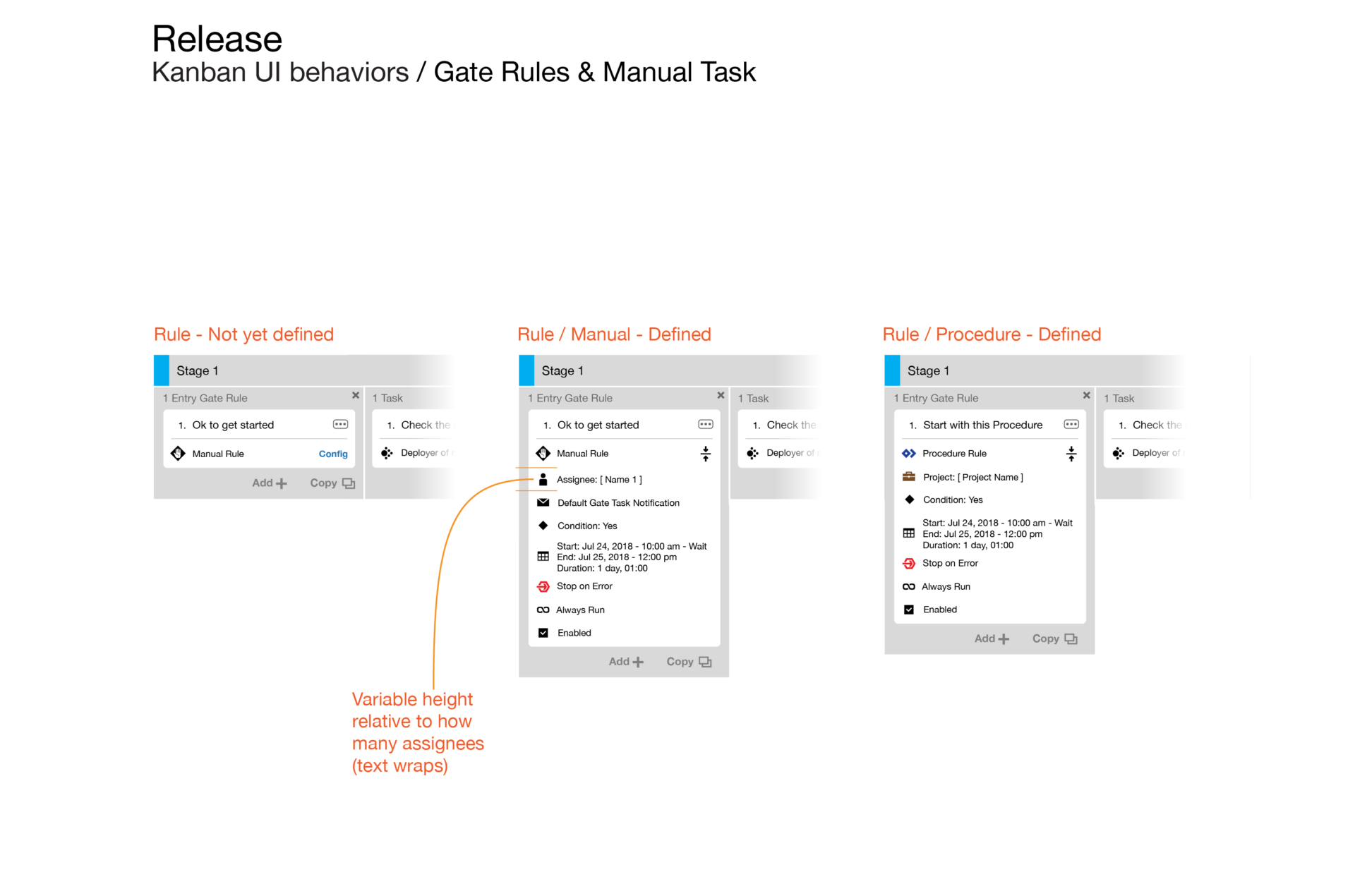
The elegance to this new design resides in presenting the inputs and metadata with clarity, and its deeper functionality readily available behind collapsable areas.
The improvement from the former UI was removing the context-changing from separate editors for each object (Release / Pipeline / Task / Gate).

Outcome
With the friction point of the unfamiliar Pipeline UI in the prospects’ evaluation now removed, this redesign became pivotal in starting a new chapter for success in sales.
The Demos and POCs could fully focus on all the product’s strengths unencumbered, which reduced the overall duration of the sales cycle, making it possible to close more deals within a quarter.
User Research ➜
Solutions to getting input
Consumerize Enterprise UX ➜
DevOps Web Application
Core Function UI redesign ➜
Release Automation
Innovation in DevOps UX ➜
Runtime Visualization
Data Visualization ➜
3D Network Topology
Enterprise Mobile UX ➜
Commercial Real Estate Sales
Short Stories + Interactivity ➜
Branded Episodic Content